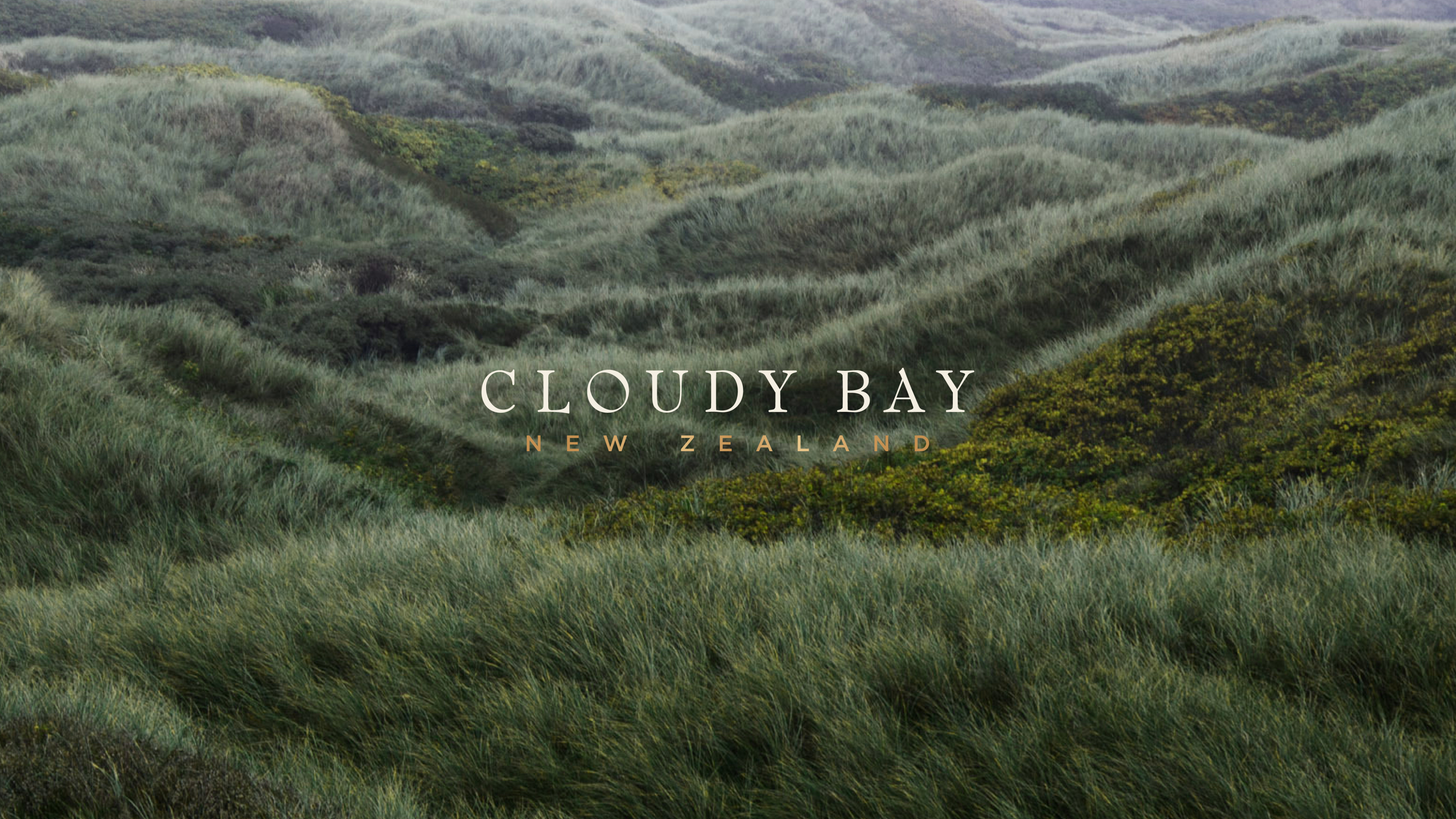
Bottling the Natural Wonder of New Zealand
After years of steady sales, Moët Hennessy saw an opportunity to take New Zealand’s Cloudy Bay to the next level by attracting a younger, more global audience.
To do so, they needed to elevate the brand and re-envision it for growth, with a flexible system that could stretch across a broad range of varietals and touchpoints, and resonate with Chinese, North American and European buyers and consumers.
To do so, they needed to elevate the brand and re-envision it for growth, with a flexible system that could stretch across a broad range of varietals and touchpoints, and resonate with Chinese, North American and European buyers and consumers.

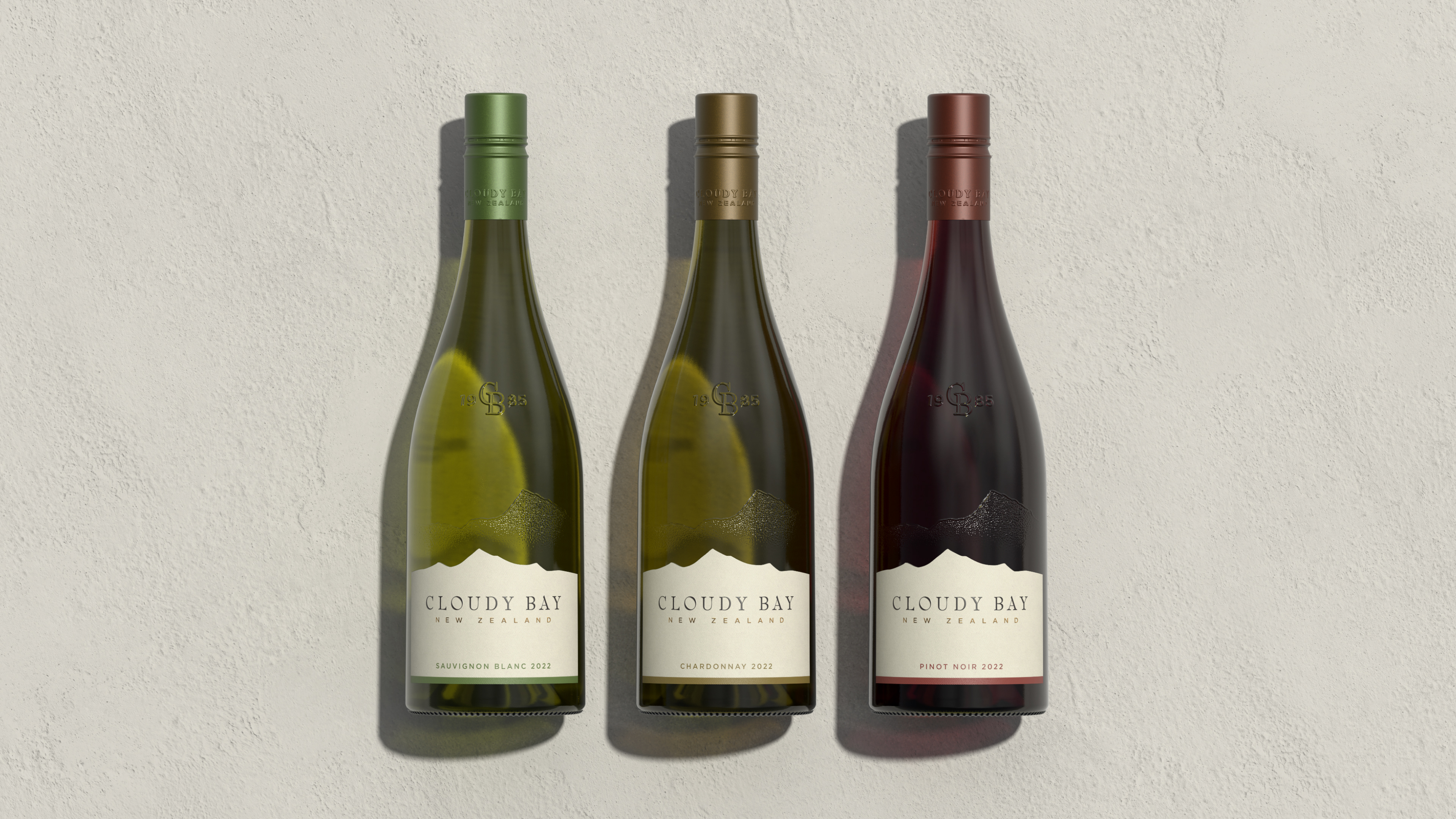
Packaging Design
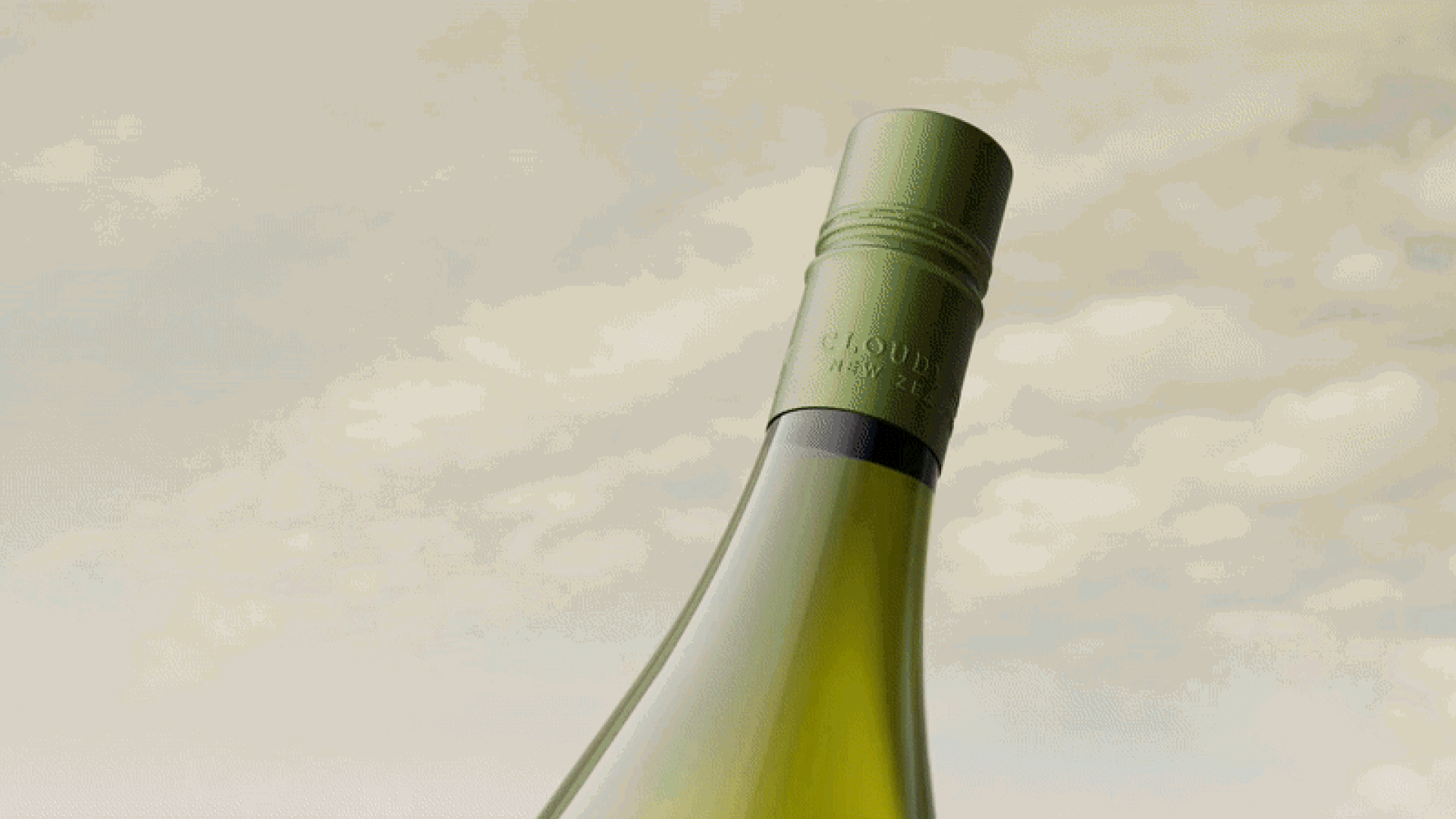
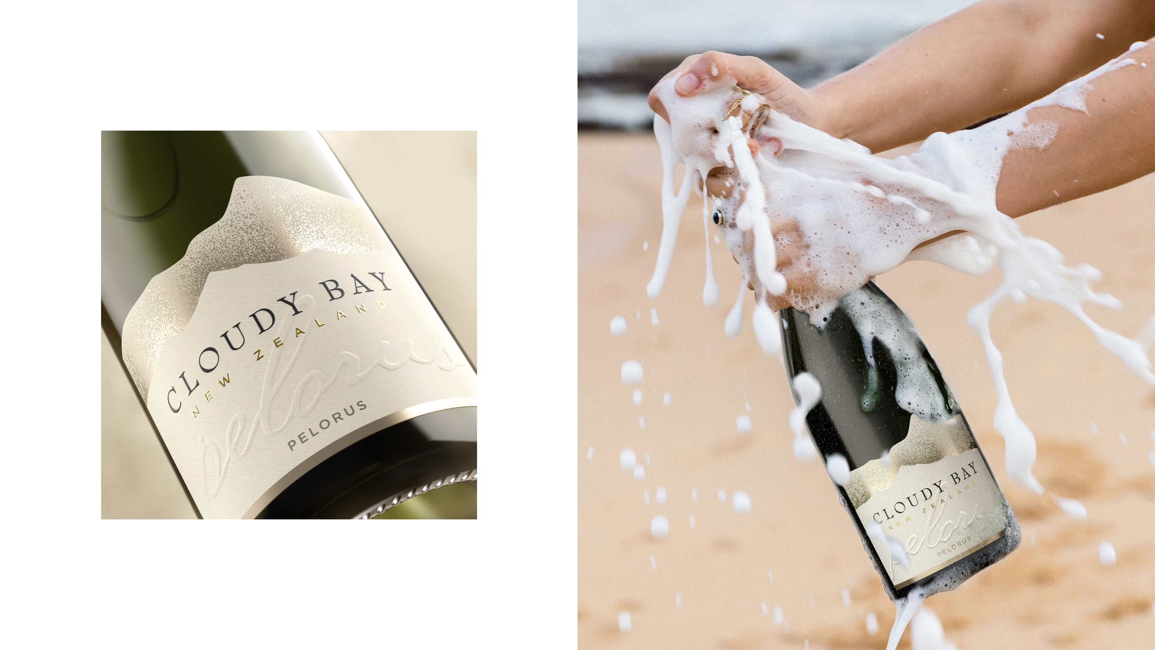
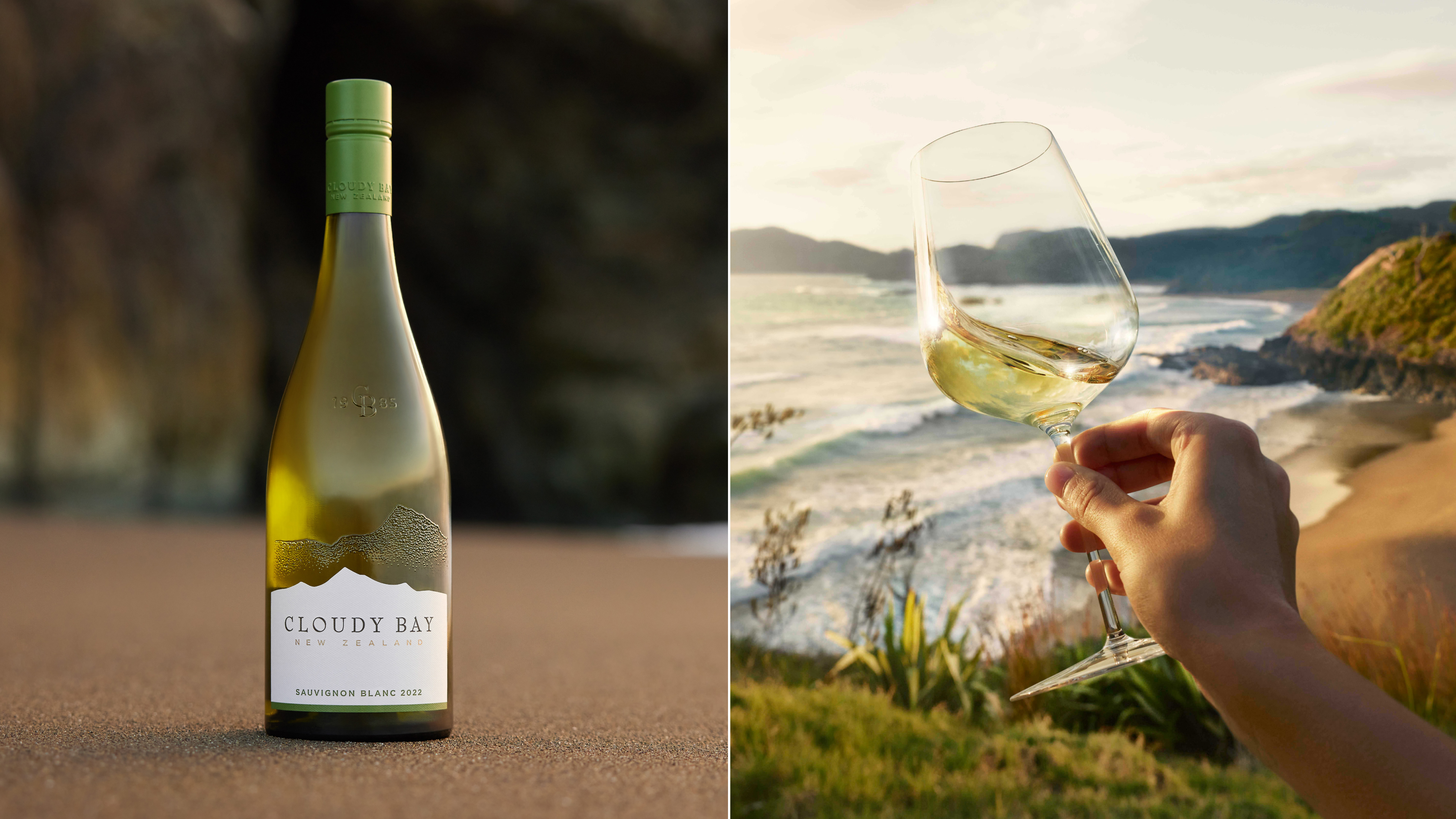
Tactile textures on the label and glass bring the land, fields and mist of the vineyard region to the bottle itself in an intuitive, sensorial way.
To evoke the wonder of Cloudy Bay’s terroir, we sought inspiration from the nearby Richmond Ranges.

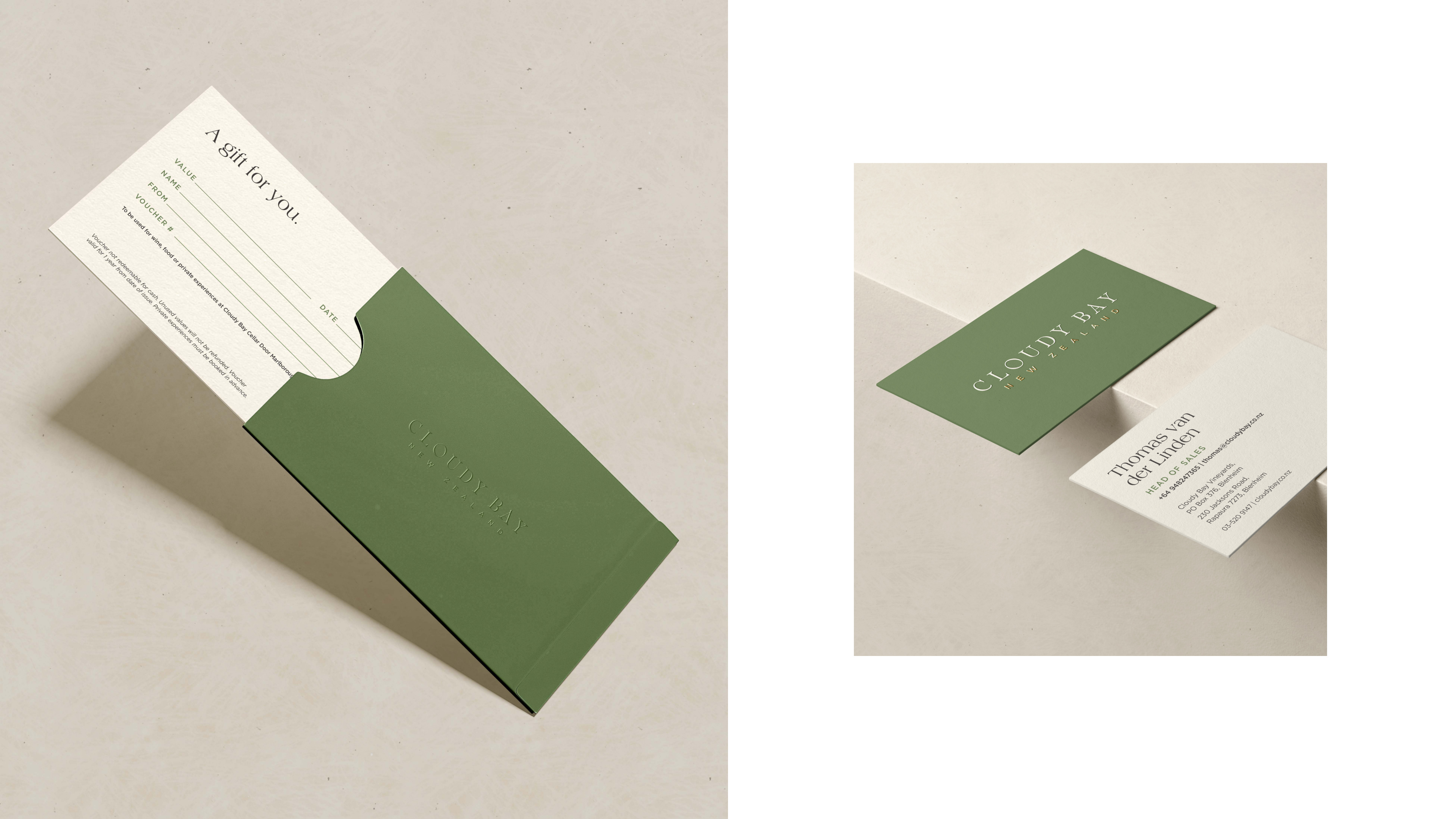
Brand Identity
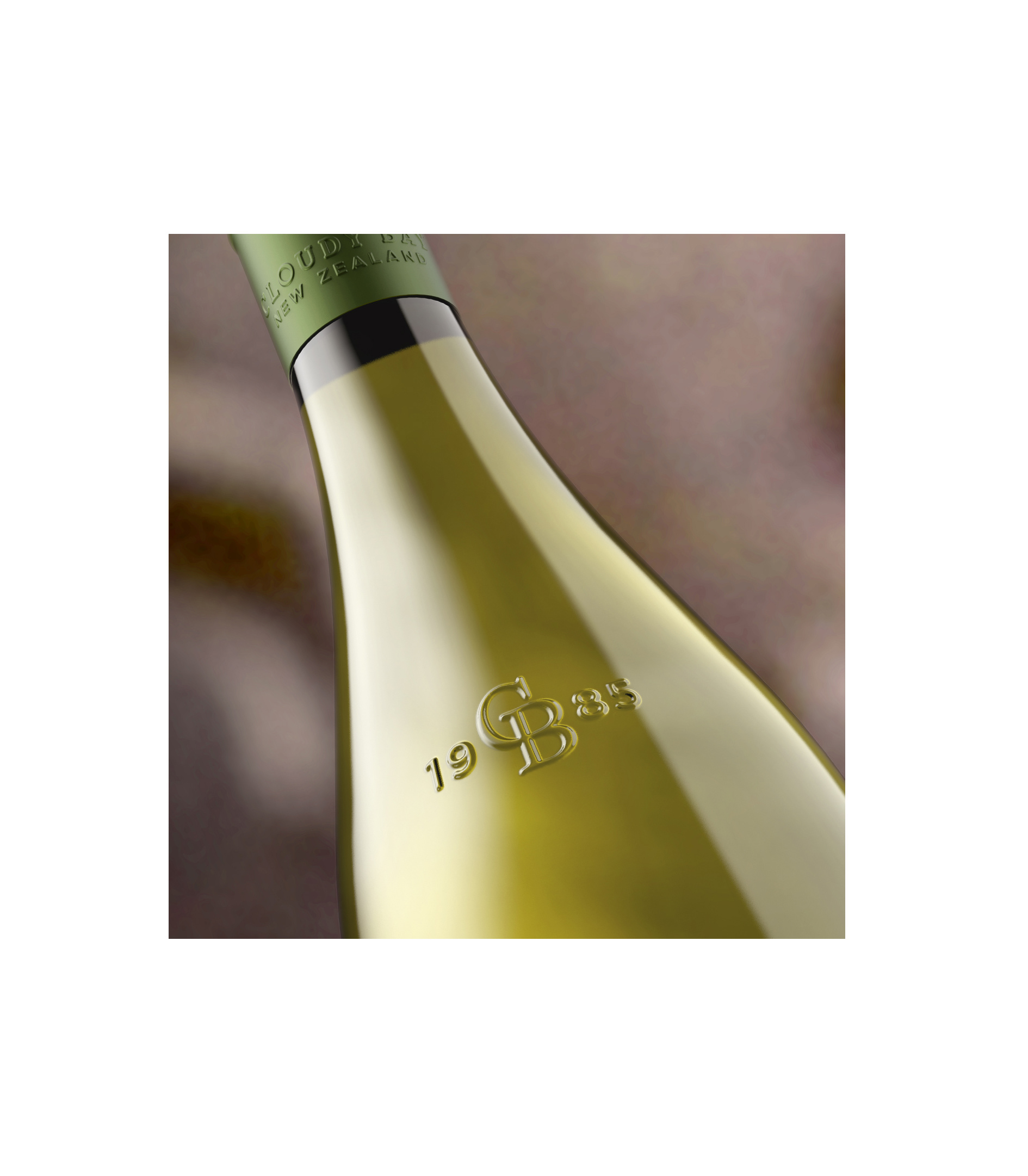
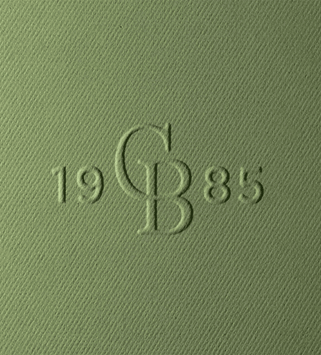
Redefining the colors, material, finishes, textures, type, graphics devices and imagery delivered on the brand’s purpose of inspiring natural wonder, while modernising the brand and bringing its heritage to life in more overt and impactful ways.
Cloudy Bay’s new color palette is grounded in intuitively warm, natural hues of wheat beige, grape green and soil brown.
Cloudy Bay’s new color palette is grounded in intuitively warm, natural hues of wheat beige, grape green and soil brown.


Art Direction
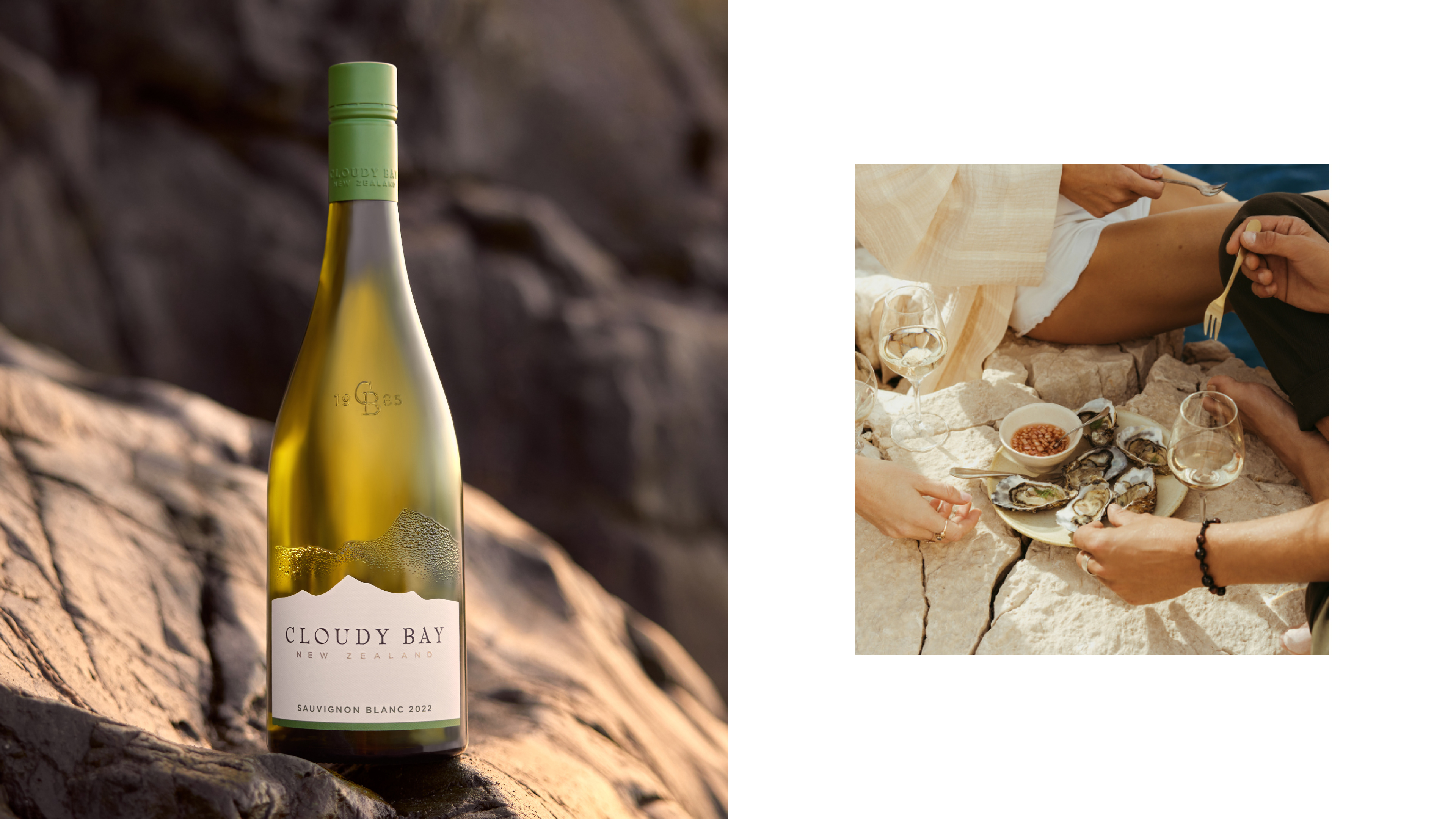
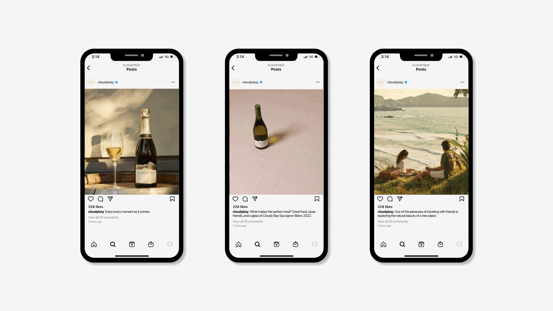
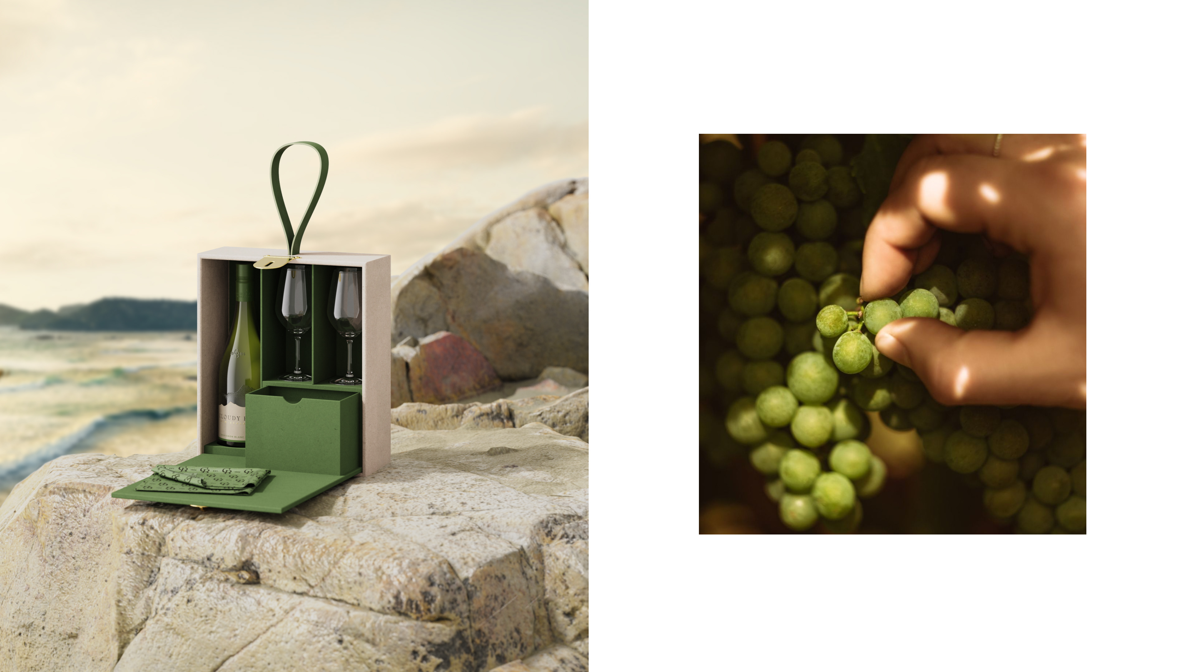
We defined an approach to brand imagery that suggests the ease, warmth, lightness and chatter of relaxed outdoor moments among friends.

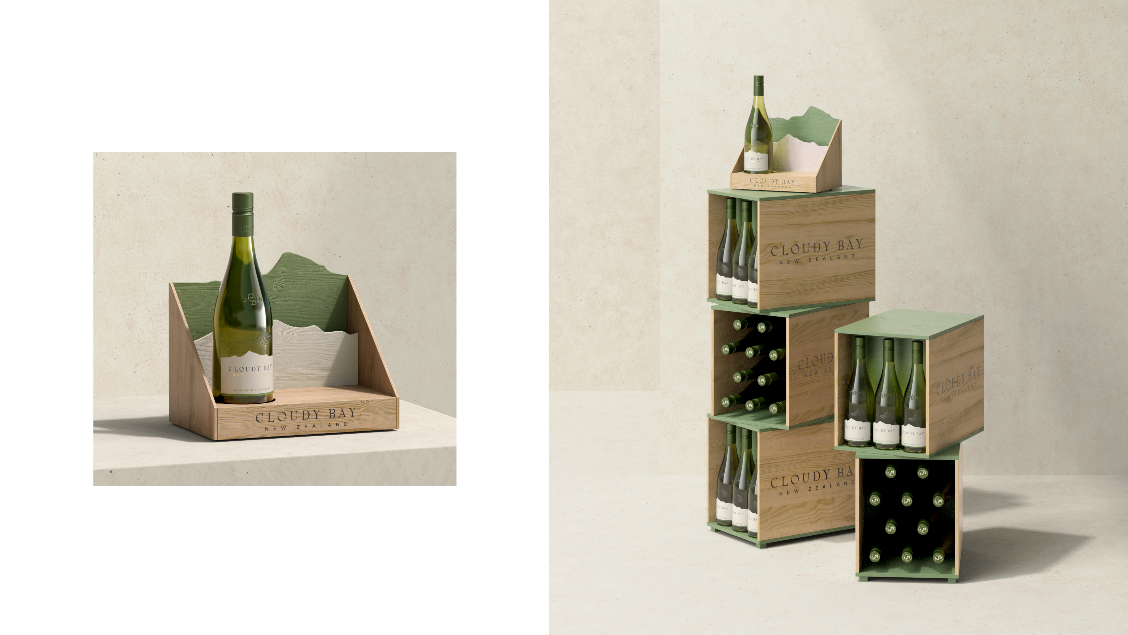
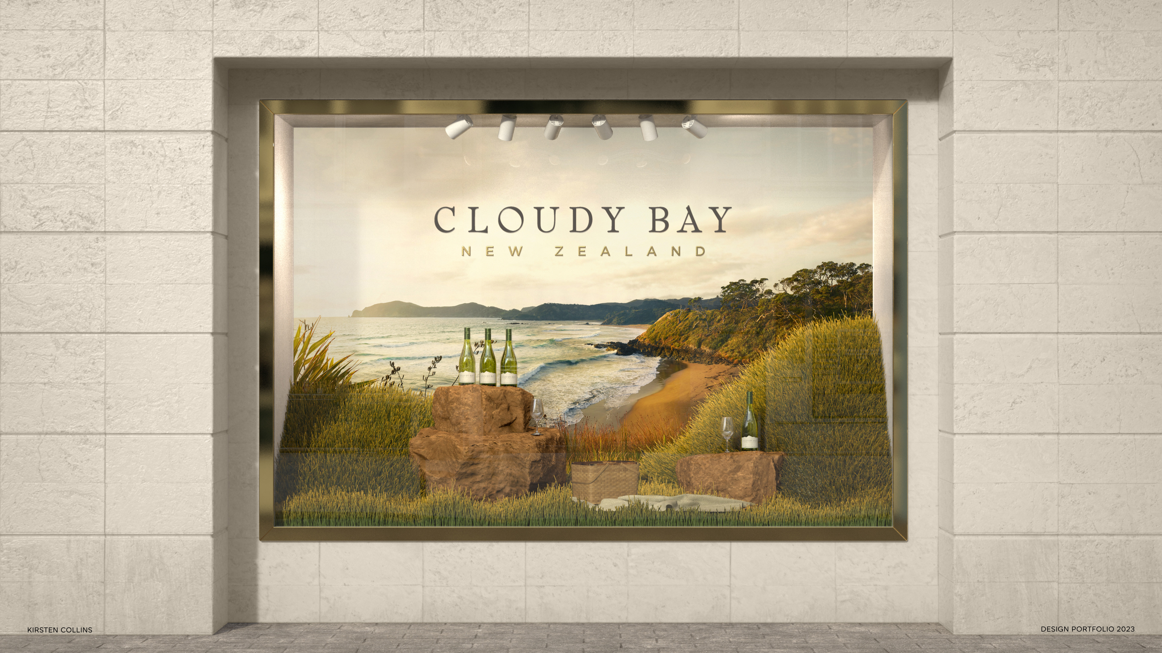
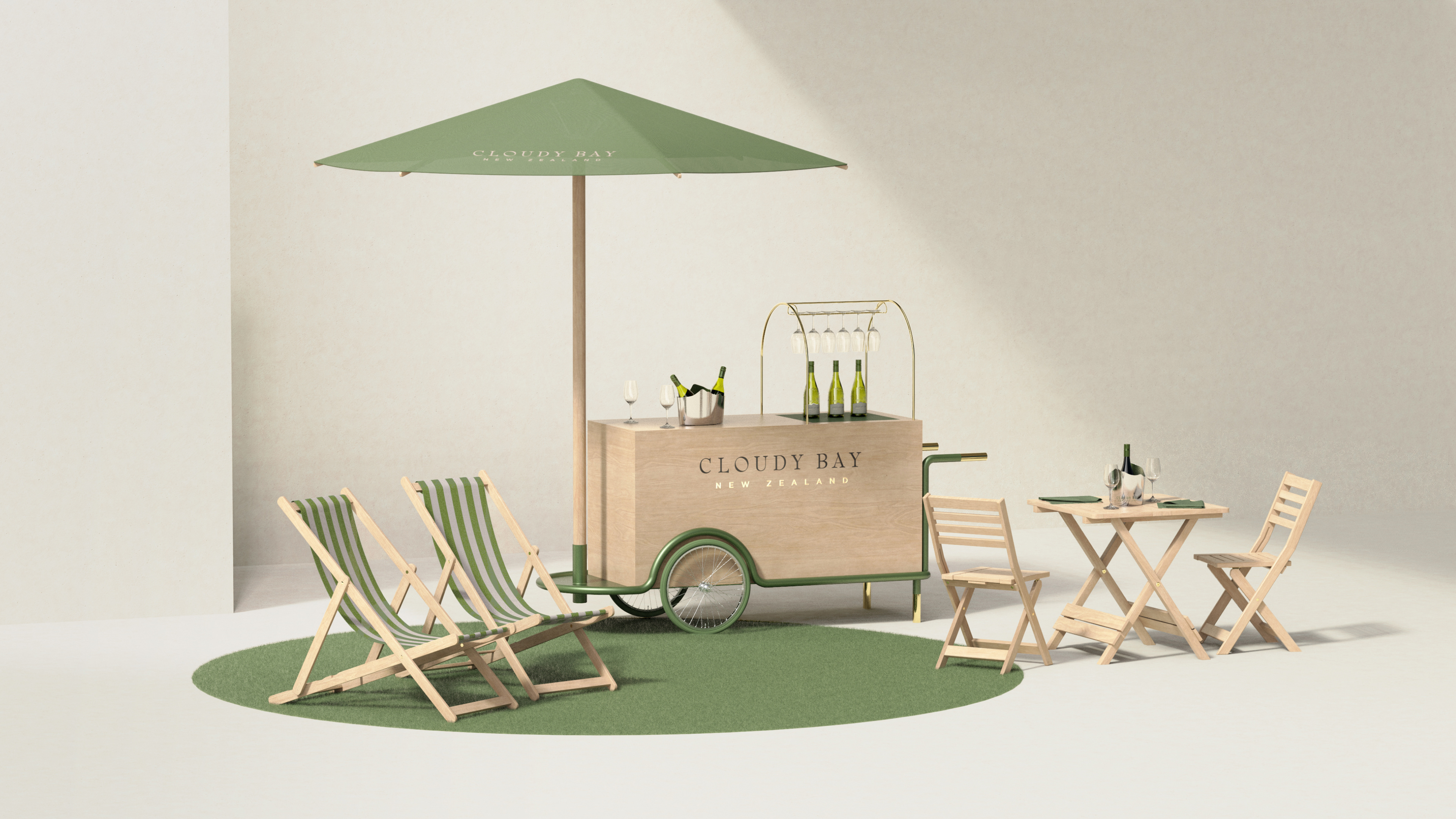
Retail Experiences
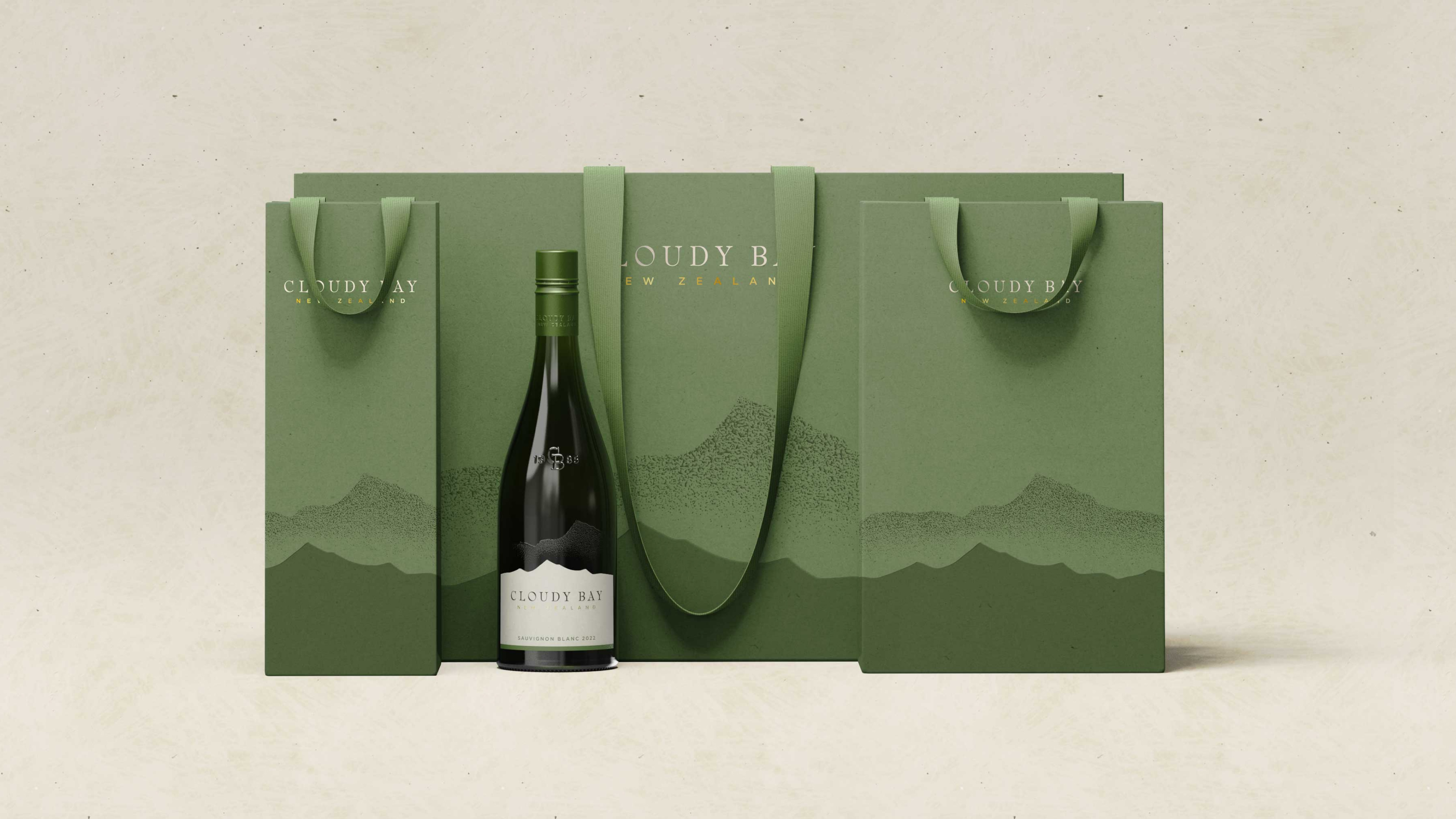
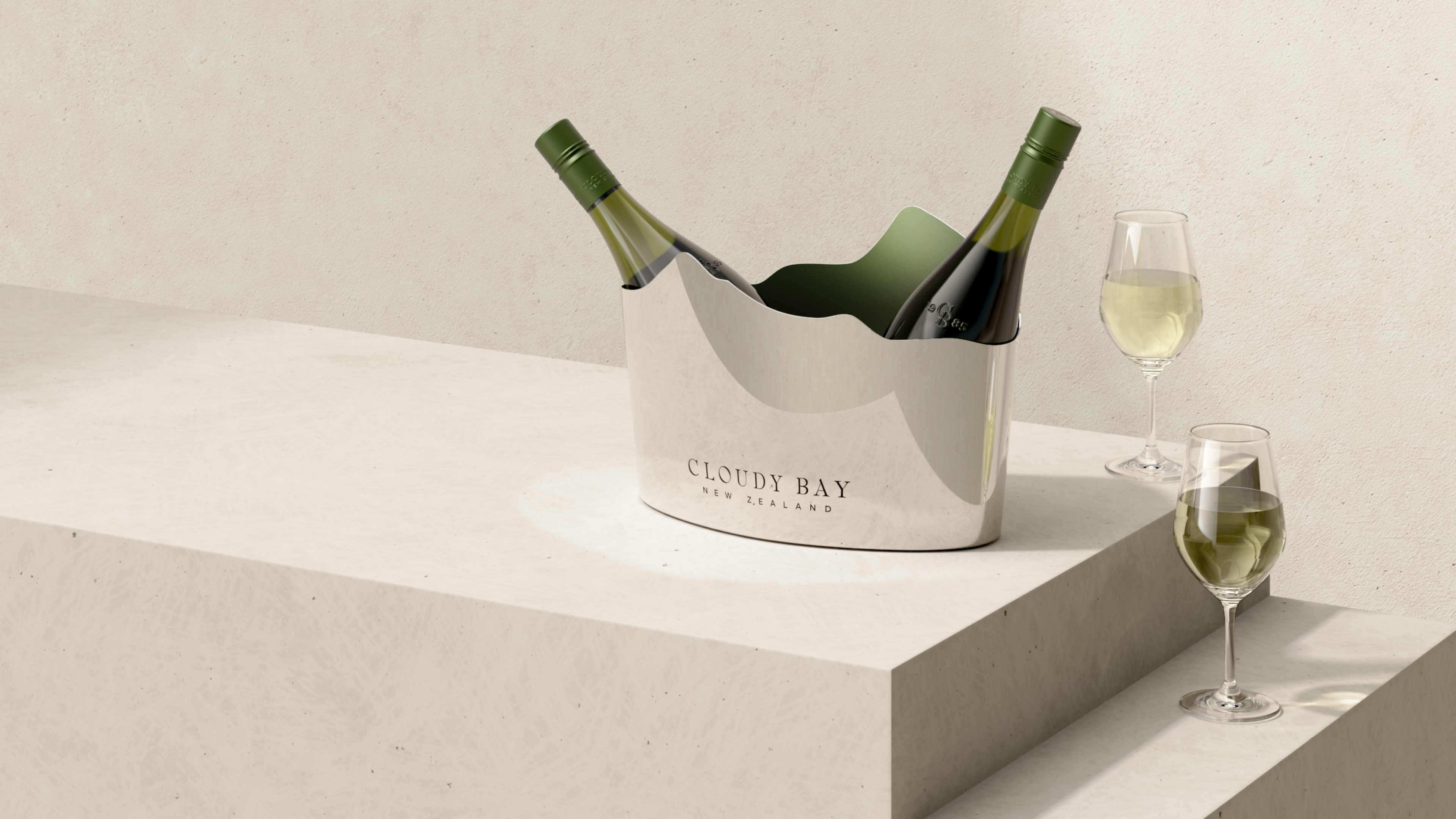
New on and off-trade brand moments, designed for launch, put Cloudy Bay at the center of immersive natural vingettes, complemented by elevated materials and finishes. The silohetted mountain range continue as a motif that extends off the bottle and into the physical world.
Team:
Gillian Haro–VP Creative Director
Kirsten Collins–Senior Brand Designer
Soizic Porhel–Senior Brand + Industrial Designer
Martin Leferve–Senior Industrial Designer
Rita Brito–Senior Account Director
Célosie Jeannin–Brand Designer
Margot Cologne–Brand Designer
Caleb Jones–Industrial Designer
Agency–Aruliden, a Material Plus Company
Client–Cloudy Bay Vineyards, LVMH
Photography–Josh Griggs